
Quick Answer: What Makes An App Listing Irresistible?
An irresistible app listing makes the right user understand three things quickly: what the app does, why it is credible, and why it is worth downloading now. App Store Optimization (ASO) is the system that connects that promise to search visibility, product-page conversion, reviews, and ongoing experiments across Apple App Store and Google Play listings.
The strongest ASO work does not treat keywords, screenshots, videos, and reviews as separate tasks. It turns them into one conversion path: the user searches, sees a relevant title or subtitle, scans screenshots, checks proof, reads the description only if needed, and decides whether the download feels worth the storage space, attention, and trust.
Why ASO Matters Before And After Launch
ASO matters because the app store listing is often the first product experience a user sees. A paid campaign, referral, search result, social mention, or website CTA may send people to the store, but the listing still has to finish the job. If the page looks vague, cluttered, outdated, or untrusted, the traffic leaks before the product has a chance to prove itself.
For teams still shaping the product, ASO should influence the launch plan early. The app name, feature positioning, onboarding promise, screenshots, review prompts, and analytics events all need to support the same outcome. If you are planning a new build or a relaunch, NextPage's mobile app development work can connect product scope, store readiness, analytics, and post-launch iteration instead of leaving ASO until the week before release.
Start With The User Intent Behind The Search
Good ASO starts with intent, not a spreadsheet of keywords. A user searching for a fitness tracker, budgeting app, language learning app, booking app, or delivery app is not only typing words. They are trying to solve a job. Your listing should show that the app understands that job before the user needs to read a long description.
Split keyword research into three buckets. Category keywords describe the market, such as meditation app or travel planner. Problem keywords describe the user's pain, such as track expenses, book appointments, or learn Spanish speaking. Brand and competitor keywords help you understand comparison behavior, but they should not make your listing sound like it is chasing someone else's identity.
Choose An App Name That Balances Brand And Search
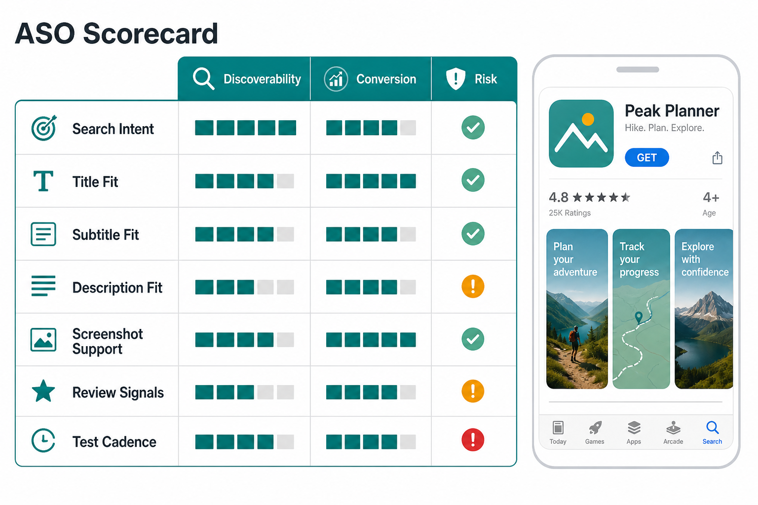
The app name is the highest-visibility listing element. It should be memorable enough to build a brand and clear enough to help searchers understand the category. A short name with a natural descriptor often works better than a clever name that hides the product or a keyword-stuffed title that looks desperate.
Ask three questions before finalizing the name. Can a user pronounce it after seeing it once? Does the store title make the use case obvious? Will the same name still work if the product expands? ASO should support positioning, not distort it. For platform decisions that affect store reach and product experience, the tradeoffs in Native Vs Cross Platform Mobile App Development are worth reviewing before launch.
Use Keywords Where They Help Users Decide
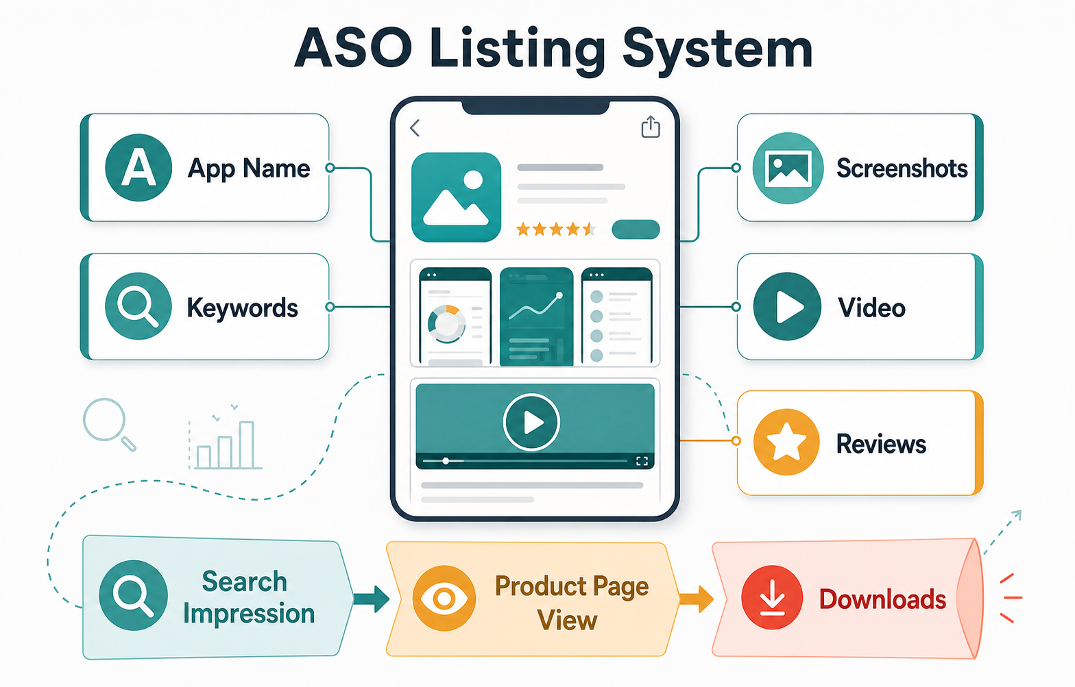
Keyword placement should feel like useful product language. The title, subtitle, short description, long description, and supporting fields should repeat the core promise naturally, but they should not read like a search-engine dump. A user should be able to scan the listing and understand the app's category, audience, primary outcome, and differentiator.
Use the primary keyword in the title or subtitle only when it fits the brand. Use secondary keywords in benefit-led phrases: expense tracking for freelancers, guided breathing for sleep, appointment booking for clinics, or delivery tracking for restaurants. Then use the description to support those claims with real features, proof, and outcomes.
Turn Screenshots Into A Product Story
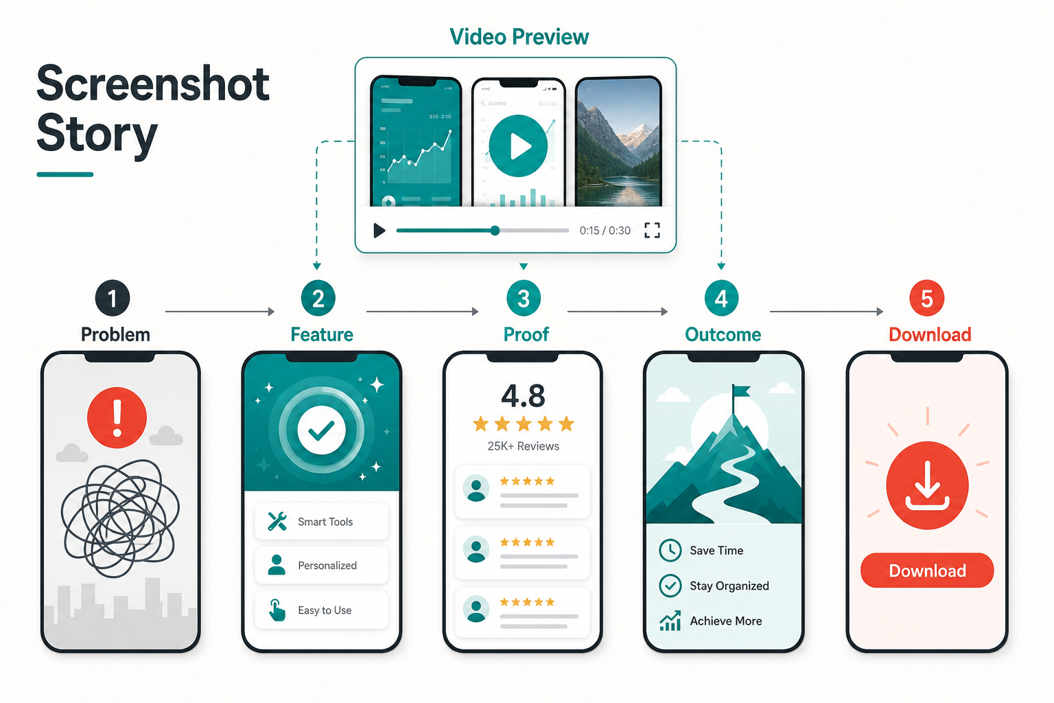
Screenshots are not decoration. They are a fast product demo for people who may never read the full description. The first screenshot should communicate the core outcome. The next few should show the main workflow, proof points, and what happens after the user succeeds. If the app has a meaningful onboarding path, the screenshot sequence should mirror that journey.
A useful screenshot set often follows this sequence: problem, core feature, proof, outcome, and next action. Avoid showing five unrelated screens with vague captions. Use concise overlay text only when it clarifies the benefit. For UX-sensitive app categories, patterns from engaging mobile app user experience apply directly: onboarding, feedback, trust, and repeat use need to be visible before download.
Make The Video Preview Work Like A Trailer
A preview video can improve confidence when the product has motion, workflow, personalization, maps, camera behavior, audio, AI interaction, booking flow, or other features that static screenshots cannot explain. The goal is not to show every screen. The goal is to prove that the app feels useful, fast, and trustworthy.
Keep the preview focused. Open with the core use case, show one or two important flows, and end with the user outcome. Avoid long intro animations, tiny text, or scenes that depend on sound. Many users will watch silently and quickly. If the preview cannot be understood without audio, it is not doing enough work for the store listing.
Write Descriptions Around Benefits And Proof
The app description should answer what the app does, who it is for, when to use it, and why it is better than the alternatives the user is already considering. Start with a direct value proposition. Then support it with feature groups, trust cues, use cases, and any relevant compliance or privacy notes.
Do not hide the practical details. If the app saves time, explain the workflow it removes. If it improves coordination, explain who gets notified and what data stays in sync. If it is a marketplace, explain supply, payments, cancellation rules, and support. For teams planning the full product budget behind these listing promises, the Custom Software Cost Estimator can help frame the build scope before store copy overpromises.
Use Ratings And Reviews As A Product Feedback Loop
Reviews influence both trust and product direction. Ask for reviews at moments when users have completed a meaningful action, not when they are frustrated, blocked, or just opening the app. A finance app might ask after a successful budget setup. A delivery app might ask after an order arrives. A learning app might ask after a streak or lesson completion.
Responding to reviews matters too. Public replies show that the team is listening, and review themes should become product backlog inputs. If users repeatedly mention confusing onboarding, slow loading, payment issues, missing integrations, or unclear pricing, those issues will hurt conversion even if the listing keywords improve.
Localize ASO For Real Market Fit
Localization is more than translating the description. Store search behavior, screenshots, pricing cues, proof points, and category expectations change by market. A screenshot that works in one country may use the wrong language, currency, visual hierarchy, or feature emphasis in another.
When expanding internationally, localize the app name descriptor, subtitle, screenshot captions, preview video, keywords, support expectations, and review strategy. The ASO section in globalizing taxi apps through internationalization and localization is a useful companion because marketplace and location-heavy apps often expose these differences quickly.
Test ASO Like A Product System
ASO is not a one-time launch checklist. Review performance every few months or after major product releases, pricing changes, campaign shifts, or competitive moves. Track impressions, product page views, conversion rate, keyword movement, install quality, uninstall behavior, review themes, and downstream activation. A listing that increases installs but attracts the wrong users can still hurt the business.
Prioritize tests by expected impact and risk. Test screenshots before rewriting the entire description. Test subtitle changes before changing the brand name. Test review prompts inside the app before asking for more ratings from users who are not ready. Keep a simple changelog so the team can connect store changes to install quality and retention.
Common ASO Mistakes To Avoid
| Mistake | Why It Hurts | Better Choice |
|---|---|---|
| Keyword stuffing the title | The listing looks untrustworthy and weakens brand recall. | Use one clear descriptor and support secondary terms elsewhere. |
| Using generic screenshots | Users cannot see why the app is different or useful. | Show a benefit-led story across the first screenshots. |
| Writing feature-only descriptions | Users must translate features into outcomes themselves. | Connect each feature group to a user job or result. |
| Asking for reviews too early | Prompts appear before the user has experienced value. | Ask after a meaningful success moment. |
| Ignoring localization | Search terms and proof points may not match local expectations. | Adapt keywords, visuals, and examples by market. |
| Not tracking install quality | More downloads can hide poor activation or retention. | Measure downstream behavior after ASO changes. |
ASO Launch Checklist
- Define the primary user intent and core search terms before writing store copy.
- Choose an app name and subtitle that balance brand clarity with search relevance.
- Write benefit-led descriptions that explain outcomes, trust signals, and key workflows.
- Design screenshots as a story: problem, feature, proof, outcome, and download reason.
- Create a short video preview when motion or workflow helps users understand the app.
- Set review prompts after meaningful success moments inside the product.
- Prepare localized listing assets for priority markets instead of translating only the text.
- Track product page conversion, install quality, activation, retention, and review themes after changes.
- Keep an ASO changelog so future tests do not repeat the same guesses.
Final Recommendation
Treat App Store Optimization as part of product strategy, not as a marketing polish step. The listing should make the app easy to find, easy to understand, and easy to trust. Every element should help the user move from search intent to confident download.
If the product is still in development, build ASO into the launch roadmap early. The app's naming, onboarding, analytics, review moments, screenshots, and retention loops should support the same promise. After launch, use store data and product analytics together so ASO improvements attract users who actually activate and stay.