
Quick Answer: Senior-Friendly App Design
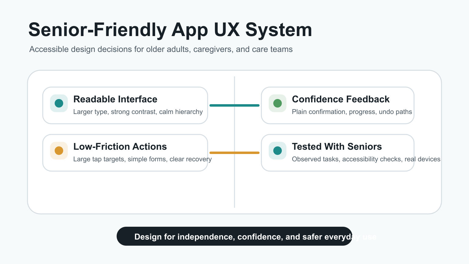
Senior-friendly app design means building interfaces that older adults can read, understand, tap, correct, and trust without feeling rushed. The practical priorities are larger typography, strong contrast, simple navigation, forgiving touch targets, clear forms, obvious feedback, accessible settings, and usability testing with real older users.
For product teams, the goal is not to create a separate or patronizing experience for seniors. The goal is to remove friction that becomes more painful with age: small text, low-contrast controls, hidden gestures, dense screens, unclear errors, complex passwords, and flows that punish mistakes. If the app touches care, wellness, transportation, finance, or daily support, senior-friendly UX should be part of the first product scope, not a late accessibility patch.

Why Older Adults Need Purpose-Built UX
Older adults often use the same phones and apps as everyone else, but the product constraints are different. Age-related vision changes can make small text and blue-heavy interfaces harder to read. Arthritis, tremors, or reduced dexterity can make small controls difficult to tap. Memory load and unfamiliar gesture patterns can make multi-step flows frustrating.
A senior-friendly app respects those realities without reducing capability. It gives users the same useful features with clearer hierarchy, fewer hidden actions, and better recovery paths. Teams building healthcare, wellness, transportation, home service, or caregiver workflows should connect this work with broader mobile app development decisions because platform behavior, notifications, offline states, and device accessibility settings affect daily usability.
Readability And Visual Design Standards
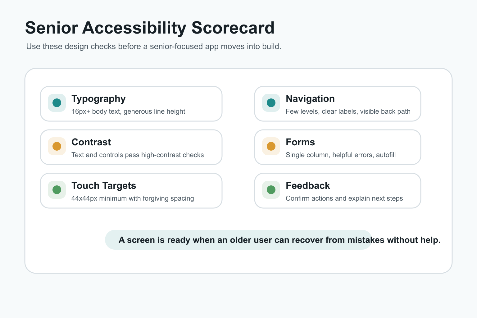
Readability is the first usability layer. Body text should generally start at 16px or larger, with generous line height, clear font weight, and enough spacing between content blocks. Avoid long paragraphs inside narrow cards, tiny helper text, and labels that disappear when a field is active.
Contrast should be strong enough for outdoor use, tired eyes, and older displays. Color should reinforce meaning, not carry meaning alone. Red and green status indicators should also include text, icons, or structural cues. Warm accent colors can help hierarchy, but the interface should still feel calm and consistent.
Touch Targets, Buttons, And Gesture Design
Small controls create avoidable errors. A practical baseline is a minimum 44x44px touch target, with enough spacing to prevent accidental taps. Primary actions should have clear labels, visible states, and predictable placement. Icon-only actions need accessible names and should be reserved for familiar patterns.
Hidden gestures should not be required for critical tasks. Swipes, long presses, drag handles, and multi-finger gestures can be useful shortcuts, but older users need visible alternatives. For forms, purchases, profile changes, medication reminders, or booking flows, the app should make the main path obvious on screen.
Navigation Should Reduce Memory Load
Senior-friendly navigation uses plain labels and shallow information architecture. Users should always know where they are, how to go back, and what will happen next. Avoid burying critical tasks behind abstract menu names or requiring users to remember what a previous screen said.
Consistent navigation also helps caregivers, support staff, and family members assist remotely. If a user can describe the screen in simple terms, support becomes easier. For products that need both a mobile app and an operational dashboard, NextPage's web app development work can help align the admin and user workflows instead of treating them as separate products.
Forms, Login, And Error Recovery
Forms are where many senior-focused apps fail. Use single-column layouts, persistent labels, specific helper text, larger input fields, and plain-language validation. Error messages should explain what went wrong and how to fix it. Do not clear entered data after an error.
Login and account recovery deserve special attention. Passwordless links, OTP flows, biometric sign-in, caregiver-assisted recovery, and clear session timeout behavior can reduce abandonment. When sensitive health, location, or payment data is involved, connect usability with secure architecture. NextPage's healthcare app development cost guide explains how privacy, roles, and integrations change scope for regulated or care-adjacent apps.
Feedback, Confirmation, And Confidence
Older adults should not have to guess whether a tap worked. Buttons need pressed states, forms need save confirmations, uploads need progress indicators, and destructive actions need clear confirmation. The app should also offer undo or edit paths when possible.
Feedback should be direct and non-threatening. Instead of "invalid input," use a message like "Enter a 10-digit phone number." Instead of only showing a red border, provide text that a screen reader can announce. These details reduce anxiety and make the product feel more trustworthy.
Accessibility Features That Matter Most
Senior-friendly apps should support screen readers, dynamic text size, keyboard and switch navigation where relevant, captions or transcripts for media, reduced motion, and clear focus states. These are not only compliance items. They are practical features for people with changing vision, hearing, mobility, and cognition.
Accessibility should also apply to content. Use plain language, short steps, meaningful headings, and direct CTA labels. For custom workflows that do not fit a generic app template, custom software development can map accessibility requirements into the product architecture before UI work begins.
Testing With Older Adults Before Launch
Accessibility checkers and heuristics are useful, but they cannot replace observed testing with older users. Recruit people who match the real audience, including users with lower vision, limited dexterity, slower device confidence, or caregiver-assisted usage. Watch them complete core tasks without coaching.
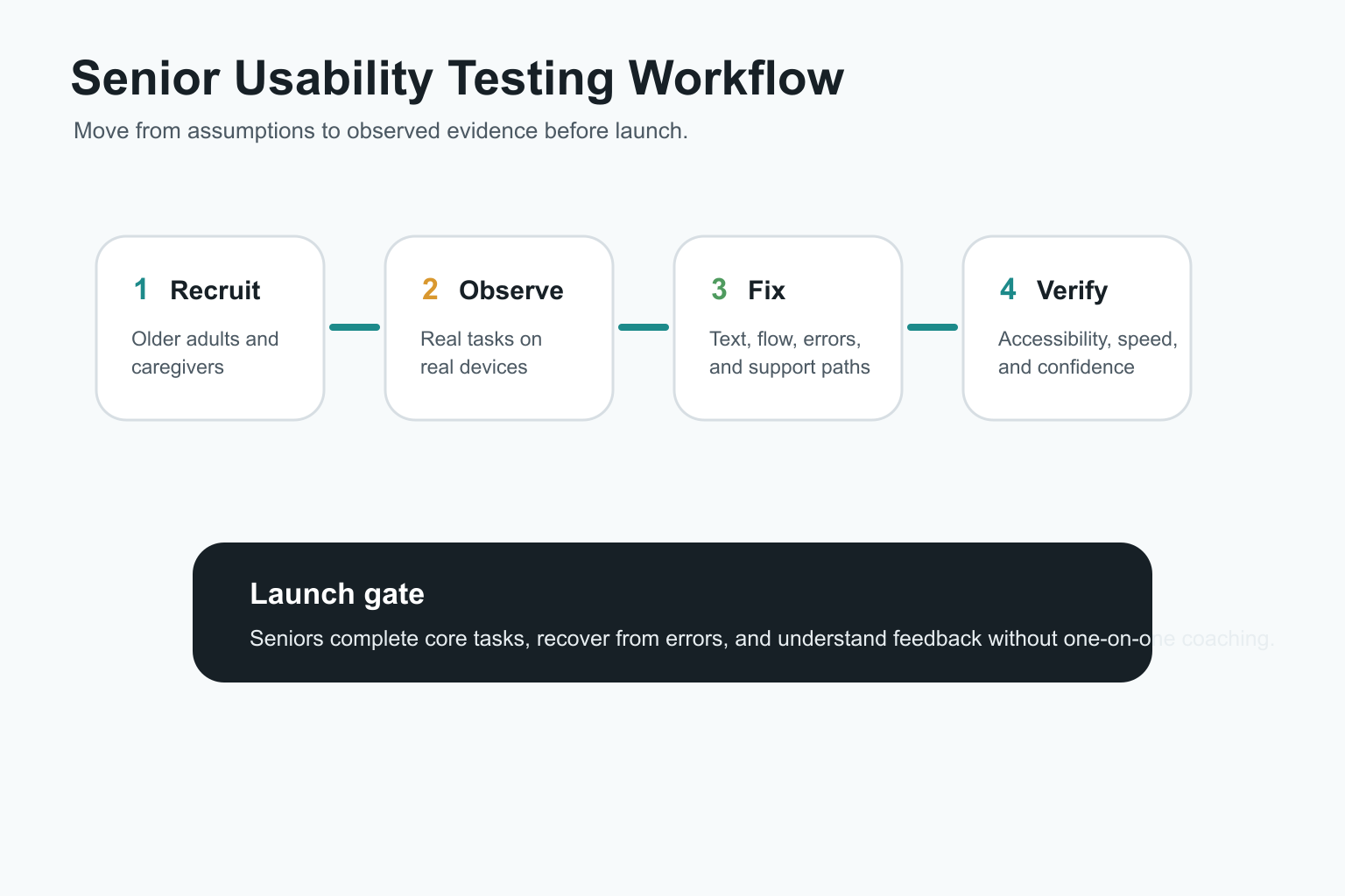
Good test tasks include signing in, changing text size, completing a booking, filling a form, editing a profile, setting a reminder, recovering from an error, and contacting support. Track completion rate, time on task, error recovery, support prompts, and user confidence. If the team is still deciding scope, the MVP Scope Builder can help separate launch-critical senior workflows from later enhancements.
Platform And Architecture Decisions
The technology choice should follow the senior user's context. A content-heavy support app may work well as a responsive web app or PWA. A care, transport, or safety app may need native behavior for notifications, background location, offline access, Bluetooth devices, camera capture, or OS accessibility settings.
When native and cross-platform options are both possible, compare the device requirements, release cadence, maintenance budget, and accessibility QA needs. NextPage's guide to native vs cross-platform mobile app development is a useful companion for deciding how much platform-specific investment the first release needs.
Common Mistakes In Senior-Friendly Apps
- Designing only for young internal testers: a flow that feels obvious to the team may be confusing for an older first-time user.
- Using accessibility as polish: text scaling, contrast, focus states, and screen-reader labels should be planned before build.
- Hiding critical actions: swipe-only or icon-only flows make recovery harder.
- Overloading the home screen: seniors need clear priorities, not every feature at once.
- Ignoring support workflows: caregiver, family, or customer-support assistance often needs product-level planning.
How NextPage Approaches Senior-Friendly App Design
NextPage starts senior-friendly app projects by mapping the user's real environment: device type, comfort with technology, accessibility needs, support network, data sensitivity, and the tasks that matter most. Then we design the smallest reliable workflow before adding advanced features.
For a healthcare, caregiver, travel, fintech, or service app, that usually means combining product discovery, UX design, mobile engineering, backend architecture, accessibility QA, and launch analytics. To estimate the first version, use the custom software cost estimator, then validate the assumptions through a focused discovery sprint.
Final Recommendation
Build senior-friendly apps around confidence. Make text readable, controls forgiving, navigation predictable, forms recoverable, feedback explicit, and support easy to reach. Then test the product with older adults on real devices before launch.
The result is not just an app for seniors. It is a better product for anyone who is tired, distracted, anxious, outside in poor lighting, or using a device with accessibility settings enabled.